What is GIS?
GIS is a software that helps users create interactive “smart maps” that visualize spatial information and help make better and wiser business decisions that are important for the organization of work. Sometimes you can’t read your data and visualize it at the same time. GIS is the right solution to help you achieve that ultimate goal, notice, and communicate something raw data isn’t able to do.
In this article, we will reveal all you need to know about GIS!
Table of Contents
Whether you are new to GIS or already an expert, through this article, we will address the importance and implementation of GIS solutions throughout numerous industries and point out the benefits that GIS offers.
Introduction to GIS
To start things off here is one of many definitions – Geographic Information System is a software tool that analyzes, stores, manipulates and visualizes geographic information.
GIS originated not only to collect and visualize data but to draw conclusions and take action based on spatial analysis. These actions can vary from useful public and social services to complex business decisions. As such, GIS is a crucial solution for managing space, organizations, communities, cities and countries.
To break it down, GIS allows you to:
- Create or import spatial and geographic data
- Organize and manage data
- Analyze data
- Visualize and display the data on a map
All this makes a big difference in your business workflow and decision making for your field teams and office managers.
Let’s keep in mind that every GIS specialist has a definition, depending on why and how they use GIS solutions.
That being said, you don’t need to be a GIS expert to use GIS technology. Many people even use GIS without being aware of it. It is indispensable in the management of business organizations, cities and countries. It allows you to answer questions about spatial data related to a particular location.
In this article, we will explore examples and use cases of GIS mapping to help you better understand and appreciate this versatile software.
Each day, countless decisions in various fields are empowered by GIS and spatial thinking. Since everything occurs in a specific location, all of these “geographic” problems require spatial reasoning and spatial analysis. That’s where GIS steps in. With just a few tricks, it can do all the work for you. The motto is – work smarter, not harder!
Thanks to GIS you can connect attribute data (the equivalent of columns in Excel) with their geographic location (coordinates, longitude and latitude), therefore bringing scattered pieces of information to life and understanding the key parameters of your spatial data visualizing it on a map.
Performing analysis of georeferenced data makes it easier to process presented information and extract what is relevant for your workflow. This includes everything, from field data collection and inspection to monitoring project progress from the office and creating maps in real-time. Many online GIS solutions enable easy collaboration and simultaneous work on data, maps and team organization.
Take a look at many use cases and examples at our blog.
The evolution of GIS mapping
GIS mapping is not as revolutionary as you may think. Fascination and interest with exploration and maps have been inherent to human nature since prehistoric times. Looking back (way back), the practice of capturing the world and drawing maps by hand were originally merely artistic, but through time their value turned them into scientific disciplines.
We have to mention one of the best known early applications of location intelligence by an English physician named John Snow (not the popular Game of Thrones character).
His map of cholera outbreaks in London from 1854 recorded cases of cholera and discovered that a vast majority was concentrated around specific water pumps. By identifying the source, people were able to take action. This was regarded as the founding event of epidemiology, but also a great example of spatial analysis and the very beginning of GIS.
Talking about the evolution of mapping, geography enthusiasts among you will probably first think of cartography and land surveying, both very closely connected to GIS. The key difference between cartography and GIS is that cartography deals with representation, while GIS is concerned with the analysis of spatial relationships.
Basically, GIS represents a blend of digital cartography and database management, computer science and geography, along with some other disciplines. Its evolution was boosted by a technology boom in the mid 20th century making it a relatively new field originating in the 1960s. Within the last five decades, GIS evolved from a concept to this robust platform that keeps on growing and changing the way we implement spatial information in our decision-making process.
Today, thousands of organizations from all kinds of fields keep creating and sharing their stories through interactive maps and visualizations.
Mapping techniques
GIS is interdisciplinary. It studies data structures and computational techniques to capture, represent, process, and analyze geographic information. GIS is a system that transforms the way an organization works. It can significantly improve the performance of an organization by analyzing and implementing spatial analysis and visualization of data into its workflow.
Let’s get more technical as we go through some terms and tools that GIS offers!
Of course, there is a lot of interesting literature available on GIS, but if you are an enthusiast like us, we suggest that you explore the world of GIS starting with this particular Geo-portal.
GIS data represents real objects (roads, land use, elevation, trees, waterways, etc.) whose representation can be divided into two abstractions: discrete objects (e.g., a house) and continuous fields (e.g. elevations). Methods that are used to store data in GIS for both kinds of abstractions mapping references are vector models and raster images.
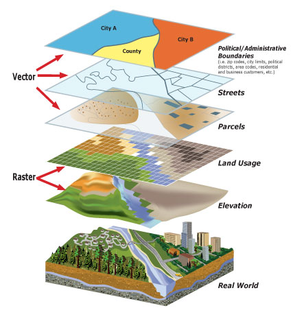
For example, the vector data model represents geography as collections of points, lines, and polygons (each component is referred to as a ‘feature’) the raster data model represent geography as cell matrices that store numeric values; and the TIN – an alternative to the raster data model for representing continuous surface as sets of contiguous, non-overlapping triangles.
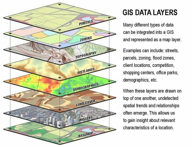
In GIS, these models store information about the real world as thematic layers. The layers are positioned and linked according to their geographic coordinates and stacked on top of each other. As a result, adequate groups of data are easily gathered, managed, and robust spatial analysis can be performed with ease.
You can analyze and compare terrains and datasets quite easily. The map you see is a simplified model of the terrain. A grid-based GIS offers some algebraic functions to help you fine-tune a search.
GIS provides a variety of outputs:
- maps
- charts
- 3D diagrams, etc
All of these unique capabilities enable GIS to reveal more profound insights into data, such as patterns, relationships, and situations helping users make smarter decisions.
To get a better understanding of all of this geo-lingo, here’s an example:
Let’s start things off with a simple basemap. A basemap is a predefined map that forms the background onto which you can add your data and create a new map.
You can add a raster image which represents the elevation of the terrain. You can add vector layers, such as a polygon layer representing the country states, a line layer representing the roads and a point layer representing cities.
You can even adjust the size of the points according to the size of the population of each city. You’ve created a map!
With this introduction into the world of GIS mapping, we’ll focus on its everyday use to get a better idea. Since its primary purpose is to produce data visualizations in the form of a map, we’ll mention a few map types.
Map Types
One of the most commonly used GIS map creations in any field is a thematic map, a way to simplify and present raw data to a broader audience.
Thematic maps are designed to highlight information on a specific topic. They can symbolize value distributions, processes, phenomena, and patterns in a straightforward way, making them easy to read. Choosing the right type of visualization will profoundly influence the understanding and interpretation done by users. It depends on the data you are working with and information you wish to communicate to the audience.
Here are a some types:
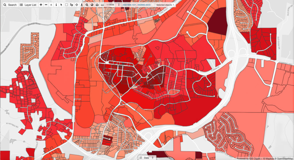
Choropleth map
This is a map which uses differences in shading, colouring, or the placing of symbols within predefined areas to indicate the average values of a particular quantity in those areas.
Those areal unit’s statistical variables are being displayed on the map. For example, you could present the population density of a country by its administrative areas, with densely populated areas shown with a darker shade while the less populated areas are shown with a lighter shade.
Other examples include per capita income, votes for a specific political party by administrative areas, frequency of bicycle use, criminal activities in certain cities, and many more.
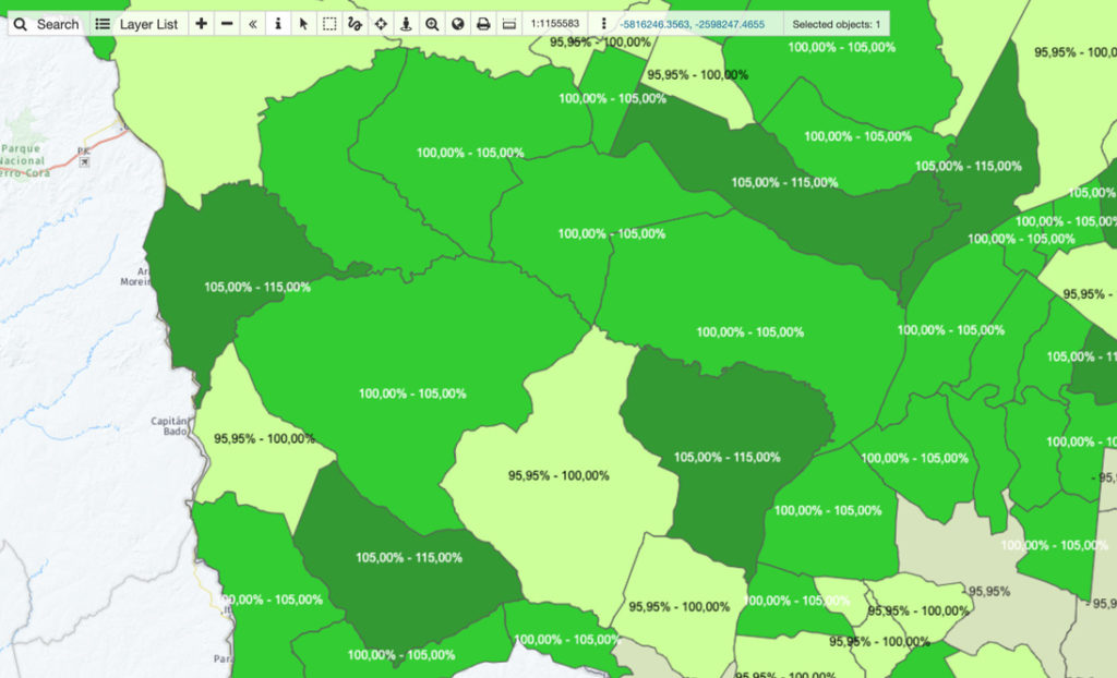
Cartograms
Cartogram is a unique type of map because it combines statistical information with geographic location (such as travel time, population, or GNP) is substituted for land area or distance. The geometry or space of the map is distorted, sometimes immensely, and sacrificed to convey the information of this other variable.
A cartogram could, for instance, consist of a choropleth map that has been modified to show the size range of data in a much clearer way.
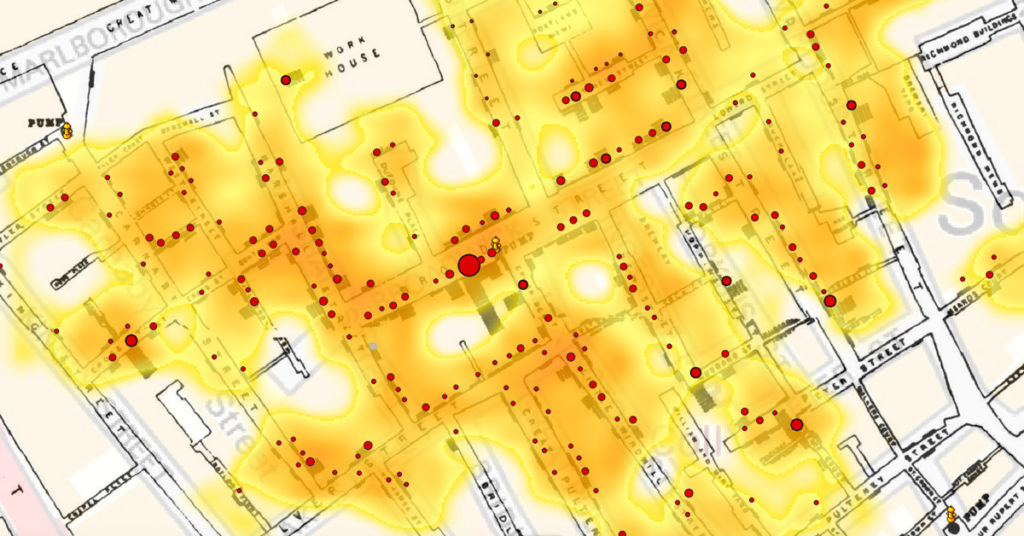
Heatmaps
A heatmap is a graphical representation of data that uses colour-coding showing the density of the values. The primary purpose is to visualize and emphasize the areas that matter the most and represent the message you wish to convey.
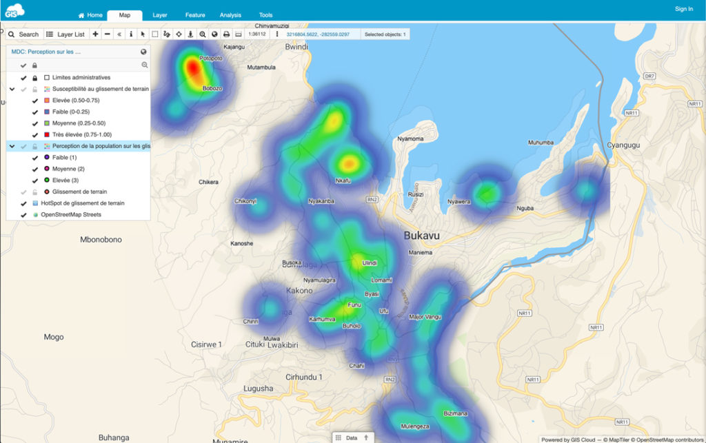
It creates an intensely coloured cloud-looking cluster where the points are more densely located. Similar to a cartogram, it uses colour to represent the intensity, and it does not apply geographical or geo-political boundaries to group data.
Graduated Symbol Map
Sometimes called a bubble map, it uses a symbol to represent the data at that specific or aggregate point, which is scaled by value – a more significant symbol represents a higher value.
The size of each symbol can be proportional to the value you are visualizing, or you can set 3 to 5 ‘classes’ of values allowing for comparison and classification of locations.
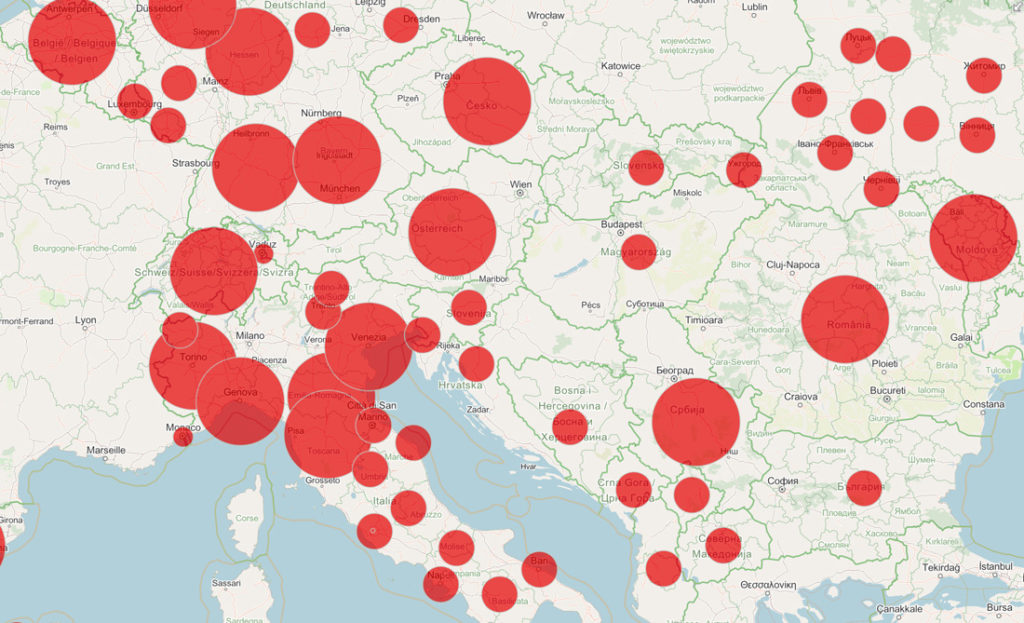
Even though the final product looks quite different, it basically works similar to a choropleth map, but it uses point size instead of colour to represent the difference among data.
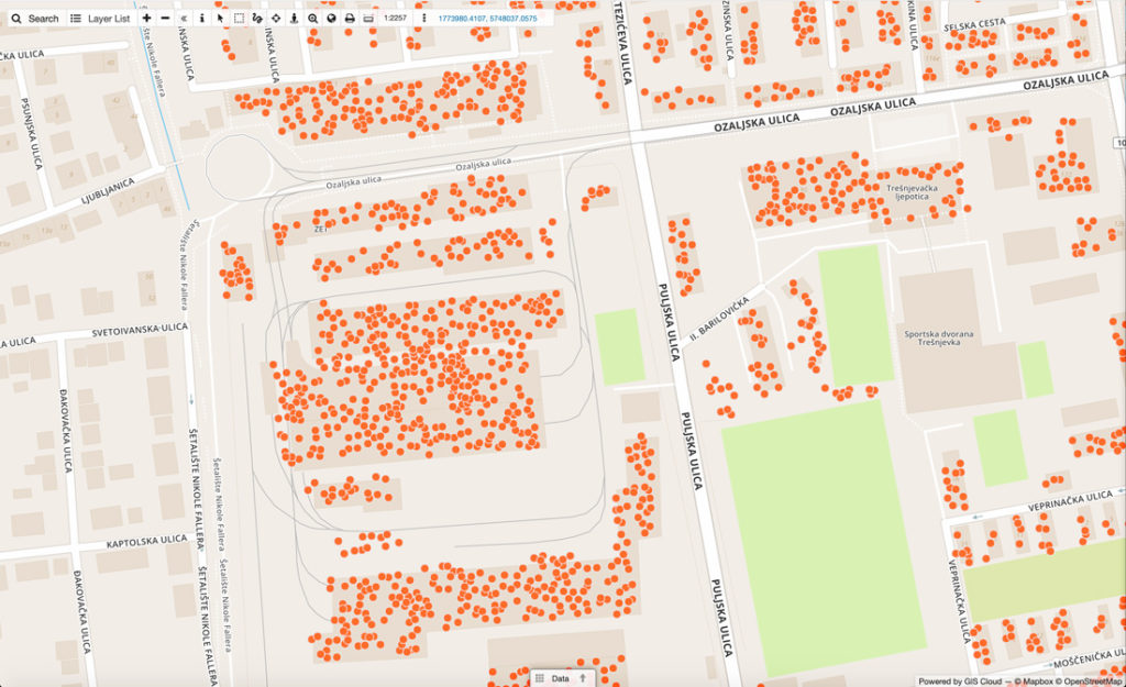
Dot density map
This one is pretty self-explanatory; it uses point (dot) features to represent your data. In a way, they look like a raw version of a heatmap, showing areas where the dots are densely clustered but without creating an interpolated coloured surface.
One of the best-known examples of this type of mapping is the before mentioned map of cholera patients in London by physician John Snow, one of the first examples of location intelligence. He mapped the location of patients dot by dot and realized they are densely located near water pumps which were the source of the disease.
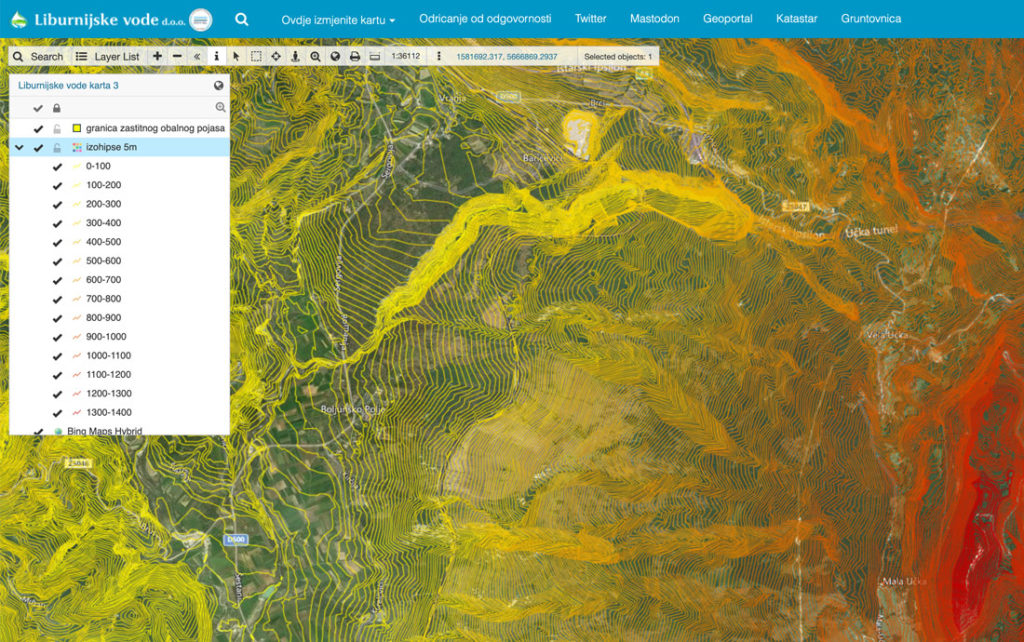
Isoline Maps
If your data focuses on continuity over distance, you might want to consider an isoline map, which uses continuous lines to indicate points of the same value. There are many types of isolines depending on what they represent, and the most famous is a contour line that represents elevation on a map by connecting points of equal height. You must have seen these on topographic maps as they are commonly used to visualize terrain (together with colours).
This was just a simple breakdown of a couple of most commonly used thematic maps but in general, depending on how you categorize your data and which results you wish to represent. There are many variations and combinations of these techniques available. You can even have a few layers of different visualizations inside one map to convey your desired information.
Keep in mind that there are a few cartographic and data visualization rules that must be followed when creating a map (most of them are based on shared knowledge and logic). Other than that, you’re free to explore and work around with the various options the software provides.
Desktop and Online Mapping Software – Unique Benefits
There is a variety of GIS software available out there. So many options and variations don’t seem to differ as much, primarily through the eyes of a rookie. GIS enthusiasts know that the power of GIS lies in its ability to perform analysis, and this is where the GIS software starts to differ. Most desktop GIS solutions include complex analysis and tools invaluable for GIS experts. GIS software is an excellent addition to the workflow of any company. It is a powerful and useful solution that will digitize and improve decision making, and help you understand spatial data better.
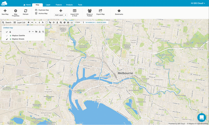
However, in recent years, one of the most important benefits of any GIS solution became the possibility to share and collaborate on maps and data in real time. We have witnessed an increased usage in online GIS solutions such as GIS Cloud, that are user-friendly and easy to learn, and can thus empower even non-gis experts.
Using online GIS solutions can be advantageous. You can utilize benefits of real-time data collection, inspection and editing, team and job management… This helps your organization to make faster, better and more accurate decisions, saving time and paperwork. It becomes easy to exchange data and geographical information between users on a different level of permissions, allowing them to participate in projects regardless of their location.
When it comes to pricing, sophisticated desktop GIS software, that is created for GIS specialists and professionals, can be somewhat expensive. If you don’t need all the comprehensive tools they offer it even might be a bit overwhelming.
You must have heard of ESRI ArcGIS, one of the leading mapping and spatial analytics software for desktop. GIS Cloud offers a Publisher for ArcMap plugin for transferring your maps and data from ESRI directly to GIS Cloud with just one click. This enables you to make your maps accessible online so you could collaborate on them with your team. This is also a simple and efficient solution for all ESRI users who wish to publish or embed maps and data into their website or blog without needing their own servers.
It is noteworthy to mention there are some great free and open-source solutions like QGIS software. We have also developed a QGIS Publisher plugin that enables you to publish your maps to the GIS Cloud Platform with just a couple of clicks, preserving your symbology. That makes your maps publicly available and ready for collaboration. You can also update and sync your maps to GIS Cloud as you go.
Whether you wish to represent statistical data with an interactive map, collect field data, or perform complex spatial analysis – there is a GIS solution out there for you! The thing is, you’ll have to explore and evaluate these options first before you find the one that suits the needs of your business the best. World of GIS mapping keeps moving forward and grows on a daily basis.
Hopefully, this article provided you with a simple yet interesting insight into the world of Geographic Information Systems. It may inspire you to explore more and take a step forward in improving and simplifying your business process and decision making.
If you need help or any additional information feel free to contact us for details.